AmberCutie's Forum
An adult community for cam models and members to discuss all the things!

MyFreeCams Profile Help!

  • ** WARNING - ACF CONTAINS ADULT CONTENT **
    Only persons aged 18 or over may read or post to the forums, without regard to whether an adult actually owns the registration or parental/guardian permission. AmberCutie's Forum (ACF) is for use by adults only and contains adult content. By continuing to use this site you are confirming that you are at least 18 years of age.

AmberCutie

ACF Owner & Admin. (I don't work for CB.)
Staff member
Cam Model
Mar 1, 2010
31,422
16
127,094
0
AmberLand (Seattle, WA)
Twitter Username
@amberlynnegirl
MFC Username
AmberCutie
ManyVids URL
https://www.manyvids.com/Profile/1000458969/AmberCutie/
Ok, first off, I don't know why so many new girls feel the MFC profile is so important to the point where they freak out and search out people to pay to help them. The built in MFC profile editor is simple and easy to use, and you DON'T need some elaborate CSS design to set up your MFC profile. Just answer the questions in the "edit profile" section of your admin pages, or leave them blank if you don't want them to appear, and use the "customize profile" link in your admin pages to change the appearance as you desire. You don't HAVE to have a fancy designed profile to let your viewers know what you're all about. The most important aspect of your MFC career is being ON cam and entertaining, not so much what's on your profile...

BUT, if you do want something fancy for some reason, let this thread be the place that you ask questions and find help for it.

Attention all MFC profile editors! Post a reply here if you have advice, services for hire, or helpful links for HTML and css design.

A few girls have gone to this site for basic help with HTML and CSS - http://www.w3schools.com/

I am going to direct all new models to this thread for info since we see at least 1 per week popping up asking for desperate "HELP!" on their MFC profiles. :)

Take it away, folks!
 
I want my About Me content to be center aligned... I don't know anything about CSS

This is a little challenging without editing the CSS, but it can be done to some extent. The other challenge is not knowing how you want the content to behave when the browser is at different sizes. For example, I am not sure if you want all of the images to remain on one line even if the browser is too small to display them all on one line. You can try this HTML code that I came up for you. Replace all of your current HTML with this new HTML. I made a best guess with my HTML as to what you were hoping to achieve.

As always, prior to making any changes to your HTML, you should always save your current HTML in a text file on your computer. (In Windows, you can just use Notepad for this.) If what I am providing here does not fit your need, you can always quickly and easily return to using your original HTML that you have saved. (You can also simply click "Preview Profile" rather than "Save Profile" to temporarily check if the new HTML works as you hoped.)

Code:
<span style="display:block;position:relative;left:-208px;text-align:center;">

<a href="https://mfc.im/KiaraPink/tip" style="text-decoration:none;">
<img src="https://img.mfcimg.com/photos2/260/26097091/364-272-573-237-11087645.png" width="200px" alt="Offline Tip">
</a>

<a href="https://www.myfreecams.com/php/message.php?input_to_username=KiaraPink&amp;nc=0.506726883276533" style="text-decoration:none;">
<img src="https://img.mfcimg.com/photos2/260/26097091/692-135-710-218-11087648.png" width="200px" alt="MFC Mail">
</a>

<a href="http://twitter.com/KiaraPink_" style="text-decoration:none;">
<img src="https://img.mfcimg.com/photos2/260/26097091/519-396-371-320-11087647.png" width="200px" alt="Twitter">
</a>

<a href="https://www.lovehoney.com.au/wishlist/0A9AE00D62804E6E9A4F47B062911C86/" style="text-decoration:none;">
<img src="https://img.mfcimg.com/photos2/260/26097091/168-757-547-322-11087649.png" width="200px" alt="Lovehoney Wishlist">
</a>

</span>
 
Upvote 0
is it possible to hide certain answers (not entire sections) without deleting them?

The answer is either "yes" or "no" as it is dependent on knowing just how secret you need your answers to be.

Reason why I say "yes": Simply preventing an answer from appearing on your profile is a very quick and easy thing to do. However, it will involve editing your CSS - which appears you are not very comfortable in doing. Therefore, I will refrain from providing how to do it to prevent damage to your existing profile customization.

Reason why I say "no": However, if you are truly needing absolute secrecy regarding a particular answer, I do not think it is possible to keep an answer completely confidential. Although I already mentioned above that it is easy to keep an answer from displaying on the profile, deep within the HTML code of the profile, a person would be able to still find the answer. Granted, it would take some work on the part of the individual to find it. But, nevertheless, the data would still be there to be found. Honestly, many people who would not see the information visibly on the profile would probably not bother trying to find it in the HTML. But, it is important for you to know that it is still possible for someone to do so.
 
Upvote 0
@asafo

Having the answers in my HTML is fine, if they were truly secret I wouldn't have put them in in the first place. I mainly just want to hide my model tags as a random string of words in the middle of my profile isn't very pretty, and I just want more control over what is shown. Some of the information I do want shown will in a graphic so I can have a pretty font etc, and I don't want double ups of info.

Will try your HTML, thanks

Also, I should have clarified
Note: I don't know anything about CSS, and only know a little HTML. I don't know if this is an obvious and easy thing to do in CSS, but when explained to me/linked to a tutorial, I'm good.
I wasn't meaning that I wasn't comfortable changing my CSS (I'm here because I put the align center thing in the CSS and it aligned things I didn't want centered also), I was more trying to explain why, if the solution is an obvious CSS thing, I didn't know or try. If there's an easier/better way to do this with CSS instead of HTML, please let me know!

I learnt HTML by messing around with Tumblr themes, maybe this is an opportunity for me to learn some CSS!
 
Upvote 0
My apologies for not fully understanding your questions. Also, please understand that only a few days ago, I got word from Amber herself about giving CSS editing instructions to those who do not know how to edit CSS. I believe she was completely correct in doing so. So, I hope you can understand why I did not provide the CSS editing help initially.

However, since you have reiterated that you are more than willing to undergo the risk of CSS editing, I believe I can help you with what to do with the CSS. NOTE TO OTHERS: If you are not comfortable with editing your CSS code, I recommend you do not do the following until you are comfortable with editing your CSS...

Each of your answers are within its own 'div' container. I believe these are all of them:

#username_container
#cam_score_container
#gender_container
#body_type_container
#ethnicity_container
#hair_container
#eyes_container
#weight_container
#height_container
#age_container
#city_container
#country_container
#sexual_preference_container
#smoke_container
#drink_container
#drugs_container
#marital_status_container
#occupation_container
#school_container
#favorite_food_container
#pets_container
#automobile_container
#tags_container

You said you wanted certain answers hidden. Therefore, for each of the answers you want hidden, simply add { display:none; } to each container you want hidden. So, for example, if you wanted the last 2 containers hidden (Automobile & Tags), you would add this to the end of your existing CSS code:

#automobile_container { display:none; }
#tags_container { display:none; }

All of the other containers for each answer would follow the same pattern, and also be towards the end of your existing CSS code.

I hope this helps.
 
Upvote 0
Thank you so much!
And sorry, I didn't realise Amber had warned about CSS advice (totally understandable though). I always keep copies when messing with code so if I screw something up big time I can always paste the old one back in.

Also, I always found it odd that they displayed gender on model profiles. They only allow female models, what else would I be?
 
Upvote 0
A simple, easy to use "modal" using :target selector
Renders nicely on MyFreeCams
The content can be changed and tip button is supported
You can play with it on codepen
https://codepen.io/cssmfcpro/pen/zPgEGp

It uses pure CSS, HTML and images. Inspired from an adult stream website (on top of the video player)
Strongly suggest to host the graphics on your own space (blog, service, website) just in case postimg is deleting them.
To be frank, I liked the idea and visual effect so I thought you might like it too and maybe turn it into your advantage.

Enjoy
 
Upvote 0
I don't think boys care too much how a girls profile looks x

I disagree, I always look and find it to be very important. If I or a guy is browsing through, a nice profile might separate 1 girl from another who has the default profile with little or no information. I'm especially interest in tip menus as this gives an idea of what the models likes to do and also what her prices are.

I would also say that I've helped a couple model friends with their profiles. Different levels of help BUT adding a bunch of options on a tip menu has helped the models.
 
Upvote 0
Sooo000ooo, I'm extremely curious about this now that the MFC Share is a thing. They've added the options of doing clubs. I've seen some girls completely get rid of their profile stuff. They can integrate the videos from MFC Share onto their profile, the clubs are on Share, and they can put deals and a Tip Menu in the Whiteboard. Is it safe to say that there's really no need for a fancy profile anymore? Or do you find that it's still essential.


MFC can add a lot of new things and that's awesome but... those new improvements and functions are targeting the commercial aspect and not the visual one.
The CSS library is helping the model make a fancy profile page which targets the visual aspect.
Club, share, Whiteboard, all are using default visual aspect which with time will become like old, green default mfc profile, boring and less effective.
It is up to the profile owner to refresh their image which empower their activity and sales with visual and why not functional new aspects.
(and here, MFC is to be applaud allowing so much freedom and flexibility)

Bottom line, the model should and has the possibility to choose and use or not a fancy profile page.
From my personal point of view, a fancy and original profile page is the model's calling card and many of the webcam performers started to understand the value of their image/brand (slowly taking advantage of it)
 
Upvote 0
I've helped a couple model friends with their profiles. Different levels of help BUT adding a bunch of options on a tip menu has helped the models.

i've been needing to do this (make a tip menu) for a long time but idk where to start and i don't want to just look at tons of model profiles and copy tip menu items from them. or is that what i'm supposed to do?
 
Upvote 0
i've been needing to do this (make a tip menu) for a long time but idk where to start and i don't want to just look at tons of model profiles and copy tip menu items from them. or is that what i'm supposed to do?

Well it's completely up to you. There's nothing wrong with going to different models menus and getting ideas. No one as the exclusive rights to "spanks" or "flash" or "show feet" or "change outfit" or whatever. So I personally would suggest make a list of things you like doing and that you are interested in. Whether the list comes from just thinking about it or ideas from others doesn't matter. Then on your list go through it and think of what prices you want to charge. Now you have a tip menu.

The only thing there that I would not recommend is going to a models page and if she has 20 things on her menu you take the 20 things word for word and the exact same prices. Just my opinion of course.

then when you have a tip menu the easiest thing to start is to put it into the whiteboard. I'd still recommend adding to profile but whiteboard is a LOT easier to begin with.
 
Upvote 0
If you don't need ow how to use Photoshop or gimp.org download pixellab app from play store.. save as jpg or png . Upload to your profile. Click image and you will see picture url and copy link. In about me section paste this link
<p><img src="copy and paste picture link here"width="600"></p>
Xox
That img tag won’t work right. MFC will strip out the “width” property. Don’t ask me why. It’s dumb. You can use height instead. I suggest starting with a height of 400.
 
Upvote 0
The "width" property remains and works in my HTML code. When using the following line as an example, the profile displayed the image with the expected width of 500 pixels. Any change of the "width" value changed the width of the image accordingly.

<img src="https://img.mfcimg.com/files/styles/mfc/images/header2/top-header-tl-Kattie_.jpg" width="500" alt="">
hmmm ok that's interesting because it's always stripped it out for me.

On looking at it you are correct the width remains.

I dug into this a little more. This is working because you have :
width = "500"

BUT

I was trying percents :

width = "80%"

This does not work and MFC will then strip the width parameter out during save for some reason.

But I'm really glad to know the pixel version works. Thank you very much!
 
  • Like
Reactions: samijanemfc
Upvote 0
Hi @Striker44 ,
Isn't it simpler to use a class via css?

img.mywidth {display:block;width:100%;height:auto;margin:0 auto}

<img class="mywidth" src="image-url-path" alt="some stuff"/>

Class added directly to any image you want to make it responsive and 100% value can be easily edited
- wonderful you use % values which makes the element fluid width, good for you thumb up.

The second version is for responsive image inside a parent element

.mywidth img{display:block;width:100%;height:auto;margin:0 auto}

<div class="mywidth">
<img src="image-url-path" alt="some stuff"/>
</div>

Any image added inside the div element with mywidth custom class will became responsive and use the same values defined in css

I do prefer (and it is recommended) to keep markup codes clean, less inline css if possible and as much responsiveness as possible.
 
  • Like
Reactions: samijanemfc
Upvote 0
So, I've made a few after a request from one of the girls I speak to regularly, but as a freelance web designer I find it rather quick and simple to improve some of your girls profiles! Professional look and a guaranteed way to boost your tokens. If you're interested contact me here or inbox me under 'baguetteaway' on MFC. I can happily show you profiles of other girls profiles I have done as well. No problem.

Thanks :)
Hi baguetteaway :)
I've been trying to figure out how to make my profile look nice and professional. Would you be able to help me out?
Thank You
 
Upvote 0
Hi @Striker44 ,
Isn't it simpler to use a class via css?

img.mywidth {display:block;width:100%;height:auto;margin:0 auto}

<img class="mywidth" src="image-url-path" alt="some stuff"/>

Class added directly to any image you want to make it responsive and 100% value can be easily edited
- wonderful you use % values which makes the element fluid width, good for you thumb up.

The second version is for responsive image inside a parent element

.mywidth img{display:block;width:100%;height:auto;margin:0 auto}

<div class="mywidth">
<img src="image-url-path" alt="some stuff"/>
</div>

Any image added inside the div element with mywidth custom class will became responsive and use the same values defined in css

I do prefer (and it is recommended) to keep markup codes clean, less inline css if possible and as much responsiveness as possible.
Dan,

Sure. My comments and example where if you were not using custom css in the advanced css section. If the profile was default but you still wanted to add images.
It’s more time consuming and difficult to help some models with images and getting a custom css in.

Since I help a couple ladies here and there I try to stick to just getting simple images in. And teach them what to do so they are less dependent on me.
HTML img tag is one thing.... getting them to override the CSS is another.


I’ve only done one full page profile so far. Not great but the girl likes it.

https://profiles.myfreecams.com/OliSunny
 
  • Like
Reactions: Dan N
Upvote 0
Hello everyone ,

I only have one question , i'm helping a model with her profile since like a year , we made it look great , but she wants a change .
I saw some profile on MFC that have multiple page .
Like in the first page you have the about me of the model , and then a link that goes to a tip menu page , videos page ....
You can't scroll down , it's only 4 different page that you can see only by clicking on the link .

She'd like to have something like that but i have really no idea how i can manage to make different page for each section of her profile.
Is it even possible for a guy like me , i learnt some basic HTML and CSS last year only to help her , but for this kind of things i feel like my very basic knowledge wont help.

Thanks if someone can help , and i apologize for my english , hope i didnt break eyes .

it can be achieved using :target selector
https://profiles.myfreecams.com/silvercowgirl
 
Upvote 0
SO I've had my MFC profile registered and "ready to go" for a couple weeks, just waiting to get a new cam since the one in my laptop is FAR too grainy. Anyhow, I've obviously been drooling over the gorgeous profiles all the established models have and want to get mine situated before I go live. I'm not looking for anything over the top by any means. I've managed to use the editor tool provided by MFC to make some minor visual changes, but it's still not QUITE what I want. I don't mind the "stock" look so much, I'd just like to have "Tip Menu" and "Room Rules" graphics and have the whole thing centered. Much like RobinMae's profile which I had found earlier in this thread https://profiles.myfreecams.com/RobinMae

I'm kinda familiar with HTML and brushed up on www.w3schools.com which was suggested in this thread, but CSS is beyond me... And I'm pretty sure there was something I read somewhere in this forum (I can't find it now) that said certain changes must be made in the "About Me" section, and then some in the CSS editor.... every time I think I'm starting to understand I open up the profile editor and draw a blank and get frustrated... If anyone is willing to assist I'd be more than grateful.

P.S. Before anyone suggest trying to get model verification, this is my goal but I have still not participated enough yet to comment in the thread to be verified. I guess lurking and reading isn't enough participation.. maybe this post will do it?

Well, if you don't want anything "fancy" I can offer some suggestions if I may.

First, you might want to make your content from About Me (username, gender, bla bla bla) a little more wider - You can do that by hiding the My Most Recent Pictures from the left side.
When you are done with that, the fun part begins.
It's not rocket science but some models are "afraid" editing markup codes by hand, don't worry even if you "fail" a bit... its going to be ok.

Now, Go to Customize > Edit your css directly page and past this markup at the very end of your current code

HTML:
body{width:80%;margin:10px auto;}
img.imgresponsive{display:block;width:100%;height:auto;margin:0 auto;}

body{width:80%;margin:10px auto;} - will make your profile layout a bit smaller (width) and centers the layout (margin:10px auto;)
img.imgresponsive - this piece of markup will make all image elements (when it's added) look 100% width (full width), responsive and also align them correctly

That's for CSS.

Now... how to use that in HTML.
Create your awesome graphics (recommended width will be around 1000px), upload them online and add them to your MFC > Edit Profile > Step Four > About Me box.

Do not forget to make the responsive by adding the class (mentioned above).
Your HTML code for a single responsive image should look like this
HTML:
<img class="imgresponsive" src="YOUR-IMAGE-URL-HERE" alt="my image"/>

Note that I've added the imgresponsive class to a single image.
Add as many images as you want using the same format. They will display one on top of another, full width and responsive.
I'm sure you know how to add a link to an image so I'll skip mentioning that.

Bottom line.
1. Add 2 lines of css
2. Edit your images, upload them online, add them to your profile and assign the responsive class.
3. Have fun & b creative
 
Upvote 0
Well, if you don't want anything "fancy" I can offer some suggestions if I may.

First, you might want to make your content from About Me (username, gender, bla bla bla) a little more wider - You can do that by hiding the My Most Recent Pictures from the left side.
When you are done with that, the fun part begins.
It's not rocket science but some models are "afraid" editing markup codes by hand, don't worry even if you "fail" a bit... its going to be ok.

Now, Go to Customize > Edit your css directly page and past this markup at the very end of your current code

HTML:
body{width:80%;margin:10px auto;}
img.imgresponsive{display:block;width:100%;height:auto;margin:0 auto;}

body{width:80%;margin:10px auto;} - will make your profile layout a bit smaller (width) and centers the layout (margin:10px auto;)
img.imgresponsive - this piece of markup will make all image elements (when it's added) look 100% width (full width), responsive and also align them correctly

That's for CSS.

Now... how to use that in HTML.
Create your awesome graphics (recommended width will be around 1000px), upload them online and add them to your MFC > Edit Profile > Step Four > About Me box.

Do not forget to make the responsive by adding the class (mentioned above).
Your HTML code for a single responsive image should look like this
HTML:
<img class="imgresponsive" src="YOUR-IMAGE-URL-HERE" alt="my image"/>

Note that I've added the imgresponsive class to a single image.
Add as many images as you want using the same format. They will display one on top of another, full width and responsive.
I'm sure you know how to add a link to an image so I'll skip mentioning that.

Bottom line.
1. Add 2 lines of css
2. Edit your images, upload them online, add them to your profile and assign the responsive class.
3. Have fun & b creative


Thank you Dan!!

Since you're so kind, one more question? :wait:
Is there a specific image size I should use in the About Me box? Or a range that I should stay within?
I truly appreciate your help so much!

xo
 
Upvote 0
Thank you Dan!!

Since you're so kind, one more question? :wait:
Is there a specific image size I should use in the About Me box? Or a range that I should stay within?
I truly appreciate your help so much!

xo

Already have that answer in my previous post.
Create a class to make the image responsive as for the image size, 1000px with is enough --- the height of the images does not matter.

Feel free to review my above suggestion again and you'll do just fine.
 
Upvote 0
Hello Hello ,

I'm still editing the profile of my friend , but we had a problem with her old profile which needed a little refresh because the site where she uploaded the image went down .
We didnt change the code except the images , images are hosted on MFC , and the profile looks just fine when i try it on my page but goes all wrong on her page .
It's like MFC doesn't take the css code , she copy paste it , confirm it , but it's not working and it looks like a normal MFC profile with some image in the about me section .
On mine it looks good

If someone know what we do wrong , or maybe could message me here , she doesnt want me to send her profile in public .

Thanks
 
Upvote 0
@randomguy Details are vague so I'm throwing blind suggestions here.
- make sure the model replaced the css correctly (based on your design the model should paste the CSS markup inside CSS box from Customize option page and not select any other CSS libraries)
- review the markup for open curly parentheses
I don't know the installed design so I may do a bit of troubleshooting so other ideas are (at this point) useless
 
Upvote 0
Hello Hello ,

I'm still editing the profile of my friend , but we had a problem with her old profile which needed a little refresh because the site where she uploaded the image went down .
We didnt change the code except the images , images are hosted on MFC , and the profile looks just fine when i try it on my page but goes all wrong on her page .
It's like MFC doesn't take the css code , she copy paste it , confirm it , but it's not working and it looks like a normal MFC profile with some image in the about me section .
On mine it looks good

If someone know what we do wrong , or maybe could message me here , she doesnt want me to send her profile in public .

Thanks


MFC have done allot of changes they added bootstrap and other css coding now You can code easy than before.
 
Upvote 0
I am currently working on a profile for a model. I have a good understanding of HTML and CSS. Her profile is taking shape and looking good.

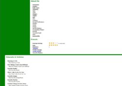
My problem is, there is some information that no longer appears on her profile I would like to have appear. I have included a screen shot so you know what I am talking about.
You will notice 3 categories:
1) About Me
2) Friends (this section does appear however I would like the ability to relocate it on her profile page).
3) Interests and Hobbies. Also at the top left side if you look at a basic profile design, it shows online status, last login, etc. I'd like that to also appear.

You will notice there are things such as Username, Hair and eye color, height, weight, etc. Then in the Interests & Hobbies section there are different things she can have on her profile such as favorite books, song, movies, etc.

Somehow in the HTML or CSS coding, these sections have been wiped out and do not appear. How and what do I edit so these categories can be included in her profile?

Any help anyone can give me will be greatly appreciated.

I have searched through the site and I have been unable to find anything that will help me. Thank you in advance to anyone who can helpClip0001.jpg
 
Upvote 0