I would possibly suggest a couple of things:
1) The image that displays on top of your "tab" for your room name in the top left just below the CB navigation, you need to either A) Bring this further down the page, or B) make it smaller. The reason being it messes up the navigation and CB do not like/allow this, and you and any people you make a bio for will get a message to remove it. So it's better to not have it happen rather than you + friends have to resolve it after the fact. I would personally keep this image static at the top, not have it fixed, it will be annoying for people. It will be hovering over the video.
2) Your social media icons I would bring further up the page, set them to approximate 250px from the very top (I see you have them from the bottom, personally i prefer to position from the top). So in this example, your top one (Instagram) would be "top: 250px", the second one (Twitter) would be (based on your own sizing currently) "top: 305px" and so on (I saw in your's you have a 55px space between each.
3) Also for the icons, with them being small, I would only add a 5px gap between each. I think you have about 20px - you can save a lot of space by decreasing these, they don't need to be so much space.
4) Make life much easier/faster for yourself and add some "alt" so if any images break or the links do not show for any reason, you can easily find and fix them, and you can easily identify them if you look at the code in the developer tools. So for example (using your existing code):
src="" style="position: fixed; left: 2px; bottom: 465px; width: 36px; height: 36px; display: block;"
alt="Instagram"
src="" style="position: fixed; left: 2px; bottom: 410px; width: 36px; height: 36px; display: block;"
alt="Twitter"
5) Add notes inside the code too, using
<!-- ANYTHING BETWEEN THESE CHARACTERS WILL BE HIDDEN IN THE BIO -->
This can also help you separate, identify, and have a clean, easy to edit/build bio.
6) Put your code into somewhere such as codepen.io and you can "analyze" the code, fix errors, and more, this can be beneficial for you so much.
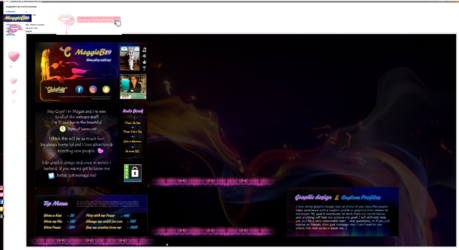
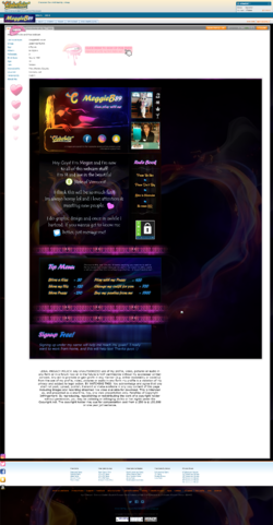
This is how it looks for me on 1920x1080px
(Because this is a full-page screenshot, your icons are displayed right at the bottom out of view, this is why it's good to have them display from the top, unless you choose to have them horizontally at the bottom, and have them fixed to follow you up/down)

 I have been experimenting with graphics and html, and was curious how this profile looks on your computer. I know it doesn't show up well on mobile phone, but for my laptop it seems to just fine. let me know thanks


 chaturbate.com
