AmberCutie's Forum
An adult community for cam models and members to discuss all the things!
Chaturbate Updates!
- Thread starter punker barbie
- Start date
-
** WARNING - ACF CONTAINS ADULT CONTENT **Only persons aged 18 or over may read or post to the forums, without regard to whether an adult actually owns the registration or parental/guardian permission. AmberCutie's Forum (ACF) is for use by adults only and contains adult content. By continuing to use this site you are confirming that you are at least 18 years of age.
You are using an out of date browser. It may not display this or other websites correctly.
You should upgrade or use an alternative browser.
You should upgrade or use an alternative browser.
Ah okay so it was not just me who noticed that the room is not told what the tip was for. I find that extremely frustrating.
Upvote
0
Those are not really problems with the app directory but more the V2 API. But indeed, missing events are serious problems.The 1-star ratings were reported to CB Support all the way back in March, but there's been a recent escalation and I submitted a new report last week asking CB Support to consider them a form of harassment under the terms of service if any user was identified leaving multiple such ratings. @punker barbie has there been progress on either the report I submitted in March or the one from last week, please? Other developers have also commented on this in the dev forum.
There are still major issues with the new app directory, though, and I've been recommending to models to use the old version as long as possible. The most serious issues are:
- Ghost or zombie apps. This is where an app continues to run even though the broadcaster has stopped it. The app can still be interacted with through commands, but the settings cannot be accessed and it cannot be shut down.
- Missing events. Everything apps do is in response to events, e.g., when a user tips, when a user follows, when an app starts. Some broadcasters are not receiving critical events, most notably events when a new broadcast starts. These events are critical for maintaining the state of apps and their absence really hinders broadcasters.
Upvote
0
I disagree: these are very much connected with the rolling out and rolling back of the new app directory.Those are not really problems with the app directory but more the V2 API. But indeed, missing events are serious problems.
Upvote
0
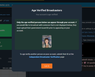
Just logged in for the day. CB has changed the wording on the "Allowed Broadcasters for this account" screen from "dismiss" to "Got It." Hopefully that translates well universally. Also changed the button for updating room subject to "Edit." Cool.
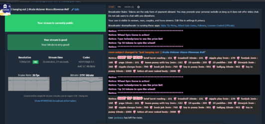
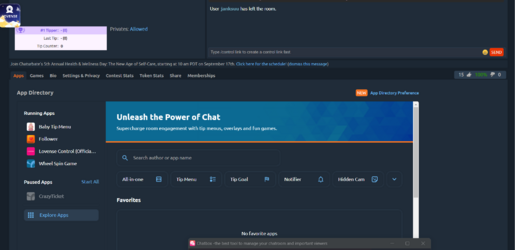
But it also appears they have changed the size of some of the fields and my monitor is pretty far away from where I actually sit in the room, so now I can't see user count and the text field for chatting at the same time, I have to scroll down or up. First world problem but it is annoying. Many of us sit far away from our monitors and have the page enhanced at 125% or above. I have mine set at 150%. It's okay at 125% but the text is much smaller and difficult to read.
But it also appears they have changed the size of some of the fields and my monitor is pretty far away from where I actually sit in the room, so now I can't see user count and the text field for chatting at the same time, I have to scroll down or up. First world problem but it is annoying. Many of us sit far away from our monitors and have the page enhanced at 125% or above. I have mine set at 150%. It's okay at 125% but the text is much smaller and difficult to read.
Upvote
0
they moved FOLLOWING > show all to the other side of the drop down menu , very unlogical ...
and recommended rooms in the following page and i'm not really waiting for that ( the following page is my page and if i want to follow others i find them somewhere else)
and recommended rooms in the following page and i'm not really waiting for that ( the following page is my page and if i want to follow others i find them somewhere else)
Upvote
0
Screen shot please?they moved FOLLOWING > show all to the other side of the drop down menu , very unlogical ...
and recommended rooms in the following page and i'm not really waiting for that ( the following page is my page and if i want to follow others i find them somewhere else)
Upvote
0
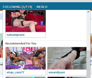
recommended in the drop down menu
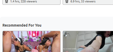
recommended in the following page , also if it's a full page
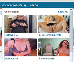
"show all" on the right side of the drop down menu , it used to be where it now shows "online rooms"
Now you need more mouse movements to open your following page.
I specially don't like the new recommended
your following page is a selection of rooms you want to see, now i get thumbnails on that page i do not want to see
Upvote
0
From the model's perspective, did they make an update which affected the window/chat sizes?
Last night I was speaking with a model, and she uses OBS, and in the CB page, the chat size is MUCH smaller than it usually is. She even mentioned something about the login or something was different. She is a model of like 10 years on CB so she isn't a newbie. On the user side we can click and drag to resize, but models can't, so I honestly couldn't think of anything to suggest.
But apparently the days before it was perfectly fine, she did nothing different and logged on last night and the sizes were different.
Any idea?
Upvote
0
View attachment 104108
recommended in the drop down menu
View attachment 104109
recommended in the following page , also if it's a full page
View attachment 104107
"show all" on the right side of the drop down menu , it used to be where it now shows "online rooms"
Now you need more mouse movements to open your following page.
I specially don't like the new recommended
your following page is a selection of rooms you want to see, now i get thumbnails on that page i do not want to see
I don't like this either. It's fine ON the following page at the bottom, but having it in the popup is weird and as hell, and it's very inconsistent anyway, sometimes it shows, sometimes it doesn't.
Upvote
0
I guess @NotYou didn't read my post. 
t it also appears they have changed the size of some of the fields and my monitor is pretty far away from where I actually sit in the room, so now I can't see user count and the text field for chatting at the same time, I have to scroll down or up. First world problem but it is annoying. Many of us sit far away from our monitors and have the page enhanced at 125% or above. I have mine set at 150%. It's okay at 125% but the text is much smaller and difficult to read.
Upvote
0
I'm pretty salty about the change. And no worries.Oh damn, sorry I kind of glossed over posts but glad it is CB end, hopefully they put it back. No idea why they did this. Were people complaining about it?
At least have it as some kind of option to change manually
Upvote
0
Perhaps users wanted more lines of chat on screen before they roll off? Completely ignoring model functionality yet again.
lol its like my old normie retail jobs all over again!
Upvote
0
Yep. Nothing was more exciting than unneeded changes!lol its like my old normie retail jobs all over again!
Upvote
0
I'm pretty salty about the change. And no worries.Perhaps users wanted more lines of chat on screen before they roll off? Completely ignoring model functionality yet again.
For a user end, nothing has changed. The chat windows and everything else seems the same. We can click and drag the video/chat to make it smaller or larger, I just tested and made it smaller, and the default doesn't seem to be bigger than it used to be, so it's weird they did this. Hopefully it was just a mistake their end
Upvote
0
Maybe they are testing in some areas because mine, in northern Europe, looks the same as always.View attachment 104108
recommended in the drop down menu
View attachment 104109
recommended in the following page , also if it's a full page
View attachment 104107
"show all" on the right side of the drop down menu , it used to be where it now shows "online rooms"
Now you need more mouse movements to open your following page.
I specially don't like the new recommended
your following page is a selection of rooms you want to see, now i get thumbnails on that page i do not want to see
Upvote
0
one of my accounts got it , an other one does notMaybe they are testing in some areas because mine, in northern Europe, looks the same as always.
Upvote
0
Same for me. I've noticed previous CB site changes that were discussed here at ACF took days or weeks to show up for me, so I think they roll it out gradually, probably by region.Maybe they are testing in some areas because mine, in northern Europe, looks the same as always.
Upvote
0
Might be account creation date? Maybe. IDK.Same for me. I've noticed previous CB site changes that were discussed here at ACF took days or weeks to show up for me, so I think they roll it out gradually, probably by region.
Upvote
0
2016 on my current model account. I just clicked on the CB landing page and it seems borked. Anyone else getting the same thing? A User Agreement and a bunch of broken buttons.Could be! Mine is from c. 2018
Upvote
0
Okay so we can't see the PM tab, the User tab if we have the screen resting on the chat text field...this is problematic for fan club members and supporter accounts and models alike. Please put it back.
@punker barbie
Or put those things in a different place. This makes it look like bad customer service on our part for those who have been put in this rollout.
@punker barbie
Or put those things in a different place. This makes it look like bad customer service on our part for those who have been put in this rollout.
Upvote
0
Can someone post screenshots of the changes, please? I only see a few of them and mostly I just wish they would be more efficient with space and consistent with style and fonts. As someone who's done UI design I'm constantly noticing the wasted space around components, the excessive gaps between labels and components, and the unnecessarily large fonts where smaller fonts have just worked just fine for years. This design suffers from what is called "chrome obesity" and really needs to be reevaluated for function and purpose.
Upvote
0
stormythunder
Cam Model
- Jan 31, 2025
- 382
- 1
- 443
- 31
- Tumblr Username
- shiektheshieka
- Streamate Username
- stormythunder
- Chaturbate Username
- stormythunder
Upvote
0
Slight tangent, but another developer put out a fixed version of Wheel Spin Game a few weeks ago: Wheel Spin Game - Fixed
The original version doesn't respond to commands if other apps are adding gifs or emojis or text to the beginning of messages.
The original version doesn't respond to commands if other apps are adding gifs or emojis or text to the beginning of messages.
Upvote
0
Anyone else have this: Past few days my chat gets stuck on a message and doesn't auto scroll down anymore from time to time.
Upvote
0
Are you streaming via OBS? if so you could reload the chrome or internet page, usually when something like this happens to me that's what I do. As if you are live reloading the page wont end the stream.Anyone else have this: Past few days my chat gets stuck on a message and doesn't auto scroll down anymore from time to time.
Alternatively I would clear cookies and cache just in case.
Upvote
0
Are you streaming via OBS? if so you could reload the chrome or internet page, usually when something like this happens to me that's what I do. As if you are live reloading the page wont end the stream.
Alternatively I would clear cookies and cache just in case.
Yeah that doesn't seem to help at all. Its after they last updated the chat box, and it happens every time someone with a longer username enters the room and the "User xxxxxxx has entered the room" takes up more than 1 line. If I zoom out and make the font smaller the problem goes away. But I need it big! lol
Upvote
0
Similar threads
- Replies
- 5
- Views
- 273
- Question
- Replies
- 7
- Views
- 248
- Replies
- 5
- Views
- 232
