What do others think of the new Google Mail user interface that goes into production in about a week? So far I am not a big fan. I do not feel more productive using it and I am spending a lot of time trying to learn how to use it. Things do not seem very obvious in some cases.
AmberCutie's Forum
An adult community for cam models and members to discuss all the things!
-
** WARNING - ACF CONTAINS ADULT CONTENT **Only persons aged 18 or over may read or post to the forums, without regard to whether an adult actually owns the registration or parental/guardian permission. AmberCutie's Forum (ACF) is for use by adults only and contains adult content. By continuing to use this site you are confirming that you are at least 18 years of age.
You are using an out of date browser. It may not display this or other websites correctly.
You should upgrade or use an alternative browser.
You should upgrade or use an alternative browser.
- Status
- Not open for further replies.
D
Deleted member 37064
Guest
I've been using it for a while since they put it into beta. Takes a bit to get used to, and now i don't think it's too bad. But, I prefer the basic and simplistic design of webmail. If I wanted advanced features, I'd use a mail client such as Outlook, or others.
Lintilla
Cam Model
- Mar 15, 2012
- 1,986
- 1
- 6,388
- 213
- Twitter Username
- @Lintilla
- Streamate Username
- LintillaTaylor
- Clips4Sale URL
- http://clips4sale.com/store/57755/LintillaTaylor
I haven't found anything meaningfully different about it except that the default font size is bigger and everything takes up more space on my screen. It's ugly, that's basically my only impression. What is anyone even seeing that's different besides the useless sidebar on the right?
I haven't found anything meaningfully different about it except that the default font size is bigger and everything takes up more space on my screen. It's ugly, that's basically my only impression. What is anyone even seeing that's different besides the useless sidebar on the right?
I did something to configure it so that now all of my labels have collapsed in and become miniature icons. I have to wave the mouse over the icons to have it expand back out to labels. Basically the entire thing feels to me like a design for Android or IOS phones, and they are trying to shovel that at desktop users too. While I am sure the ultra-efficient use of space is something I will get used it, I rather liked the current Gmail because things were just laid out in a way that made use of the extra desktop space of a real computer. Overall I feel like I am fighting a phone app and trying to find ways to reconfigure it as a desktop app.
Also, that use of larger fonts is seriously annoying me. I liked being able to see more pieces of email on the screen in the classic version.
Lintilla
Cam Model
- Mar 15, 2012
- 1,986
- 1
- 6,388
- 213
- Twitter Username
- @Lintilla
- Streamate Username
- LintillaTaylor
- Clips4Sale URL
- http://clips4sale.com/store/57755/LintillaTaylor
I did something to configure it so that now all of my labels have collapsed in and become miniature icons. I have to wave the mouse over the icons to have it expand back out to labels. Basically the entire thing feels to me like a design for Android or IOS phones, and they are trying to shovel that at desktop users too. While I am sure the ultra-efficient use of space is something I will get used it, I rather liked the current Gmail because things were just laid out in a way that made use of the extra desktop space of a real computer. Overall I feel like I am fighting a phone app and trying to find ways to reconfigure it as a desktop app.
Also, that use of larger fonts is seriously annoying me. I liked being able to see more pieces of email on the screen in the classic version.
If you mean the labels under the search bar, then icons were always the default and you may have changed it in the past. Changing to new Gmail reverted that for me. In settings you need to change it back to text from icons. Otherwise if you're referring to the left column, just click the icon next to the Gmail logo.
What is anyone even seeing that's different besides the useless sidebar on the right?
I forgot about the right sidebar. I have my google hangouts (chat) set to be on the right. So that calendar/tasks sidebar I minimized immediately and haven't looked at it since.
Also, that use of larger fonts is seriously annoying me. I liked being able to see more pieces of email on the screen in the classic version.
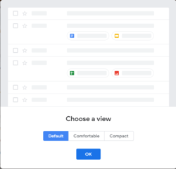
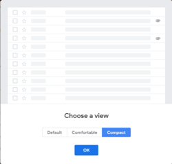
You can still use the new gmail, but with the 'more email' on the screen. Upper right corner of the email listings is a settings gear icon. You can select 'Display Density' to get a choice. Compact pretty much brings it back to the old sizing, while still keeping the other new features.


Otherwise if you're referring to the left column, just click the icon next to the Gmail logo.
Ah, they changed the icon to the left of the Google icon to become a UI toggle switch instead of a drop down menu. Really weird.
But thank you for the rescue
I will have to log into the web app to have a look and see O_O
You mention productivity, do you use it for work or something? Even at work I don't send anywhere near enough emails to be worrying about "productivity" issues over a new email interface. Especially since the vast majority of email related time is spent typing the things in the first place.
As with everything, you may be in a state of "comfort" so any change is bad. Oh well.
I will have to log into the web app to have a look and see O_O
You mention productivity, do you use it for work or something? Even at work I don't send anywhere near enough emails to be worrying about "productivity" issues over a new email interface. Especially since the vast majority of email related time is spent typing the things in the first place.
As with everything, you may be in a state of "comfort" so any change is bad. Oh well.
Those are fair points. My main complaint is that I am spending time to learn a new UI, but overall I do not have the feeling that the UI is contributing anything new or better to me. I embrace change when there are a lot of new features. I dislike change when the reason for the change is mainly that someone just had to do something with all of those billions of dollars they are coughing up each year. This revision feels very incremental to me and I am not perceiving a lot of improvements. And, again, the UI feels designed for a phone. I want the Windows desktop version to be designed for a computer and to really exploit that extra desktop space.
LilyOhRiley
Cam Model
- Feb 3, 2016
- 243
- 528
- 143
- Twitter Username
- @lilyohriley
- Chaturbate Username
- lilyohriley
- ManyVids URL
- https://www.manyvids.com/Profile/264007/LilyOhRiley/
- Clips4Sale URL
- http://clips4sale.com/store/98429/lilyohriley
I might be an outlier, but I actually enjoy the new layout - being able to mouseover each message and have accessible options has streamlined some of my inbox cleaning - and the UI doesn't feel drastically different.
I might be an outlier, but I actually enjoy the new layout - being able to mouseover each message and have accessible options has streamlined some of my inbox cleaning - and the UI doesn't feel drastically different.
I wonder if I disabled something. What mouseover are you seeing and in what context? I see the right click menu on each message is still the same.
D
Deleted member 37064
Guest
I'm wondering if she's referring to the icons on the far right? I don't use Chrome, so there might be some options I'm not seeing.I wonder if I disabled something. What mouseover are you seeing and in what context? I see the right click menu on each message is still the same.
I'm also not a big fan of it, just like I don't like the new google calendar. I wish you could have a choice to go back to classic.
For the moment, if you click on the "settings" wheel in the upper right, there's an option to go back to classic. Unsure of how long that will stay there however.
I'm wondering if she's referring to the icons on the far right? I don't use Chrome, so there might be some options I'm not seeing.
I think you are right. For my own use that is not more convenient than just right clicking on the message and getting the same options as menu items.
- Status
- Not open for further replies.
Similar threads
- Replies
- 0
- Views
- 842
- Replies
- 11
- Views
- 731
- Replies
- 21
- Views
- 10K
- Replies
- 33
- Views
- 2K
- Replies
- 1
- Views
- 261


