

I just started web camming tonight, and I made my profile, but it is very bland. I just used the colors that MFC gave me. I want my profile to pop and I want to be able to attract people to it. I want to add pictures and graphic words. How do I do that? Some profiles look like they came straight from myspace(meaning you can add music and stuff). I really want to have a pretty profile!! HELP..thanks so much
AmberCutie's Forum
An adult community for cam models and members to discuss all the things!
Profile
- Thread starter AlmondBeauty
- Start date
-
** WARNING - ACF CONTAINS ADULT CONTENT **Only persons aged 18 or over may read or post to the forums, without regard to whether an adult actually owns the registration or parental/guardian permission. AmberCutie's Forum (ACF) is for use by adults only and contains adult content. By continuing to use this site you are confirming that you are at least 18 years of age.
You are using an out of date browser. It may not display this or other websites correctly.
You should upgrade or use an alternative browser.
You should upgrade or use an alternative browser.
- Status
- Not open for further replies.
Read Make Your Own Graphics (Without special programs!) and say thanks to Evvie.

- Jun 19, 2012
- 2
- 2
- 45
I became a cam girl 3 days ago, and I to want to improve my profile.
I had a look at the paint graphics post and I think it was great, very informative.
However I am struggling even with the most basic of things on the MFC site. I can't work out where to post the html codes in the edit my profile page? Every time I make an alteration there is an error.
Is there another way of doing this? How do I over ride the presets on there i.e the form you fill in? I want to make it my own or at least adapt that into another style.
I don't need help with codes I just need to figure out where to post them.
Any help much appreciated!
x
- Feb 12, 2012
- 6,720
- 27,507
- 161
MFC has a limit on what HTML codes you can use. If you end a tag improperly or use a banned code, it gobbles up your profile.CandyOrchid said:I became a cam girl 3 days ago, and I to want to improve my profile.
I had a look at the paint graphics post and I think it was great, very informative.
However I am struggling even with the most basic of things on the MFC site. I can't work out where to post the html codes in the edit my profile page? Every time I make an alteration there is an error.
Is there another way of doing this? How do I over ride the presets on there i.e the form you fill in? I want to make it my own or at least adapt that into another style.
I don't need help with codes I just need to figure out where to post them.
Any help much appreciated!
x
I'm working on a rather huge post on how you can make your own snazzy profile without any coding knowledge or experience. However I've been a little busy lately so it keeps getting delayed.
most of the html we post goes straight into the "about me" section.
on my profile all my tags are type into the text box that's for "about me."
you can remove a field by leaving it blank, but other than that you can't change the questions or the order they appear in, unless you do some pretty heavy CSS meddling (which is beyond my level of caring, so i havent tried.)
superauzesome does it though
first clear your browser cache.
Basic html works ok in About Me section, even embedded playlist mp3 players work ok (try MixPod.com for mp3 playlist)
example of basic html:
raffle ticket / banner / clickable image
<a href="url"><img src="img url"></a>
for something more professional you had to have some css/css3 skils
add some attributes to a class in css mod and in About Me section add the div with the class you just modified...
If what I type here has no meaning for some of you, I offer my commercial services regarding css-html mfc profile customization.
Have fun & b creative :violin:
mfc-css-pro said:<a href="url"><img src="img url"></a>
at least
Code:
<a href="url"><img src="img url" /></a> ray:
ray:GingerOwnsChris said:mfc-css-pro said:<a href="url"><img src="img url"></a>
at least
puhleaseCode:<a href="url"><img src="img url" /></a>
bb properly formatted code is sexy
and btw is still wrong :whistle:
mfc core strips double quotes so have fun only with one
<a href='url'><img src='img url' /></a>
emmm...let's throw out another coding tip:
style='cursorointer' css property in HTML field (AboutMe section)
:whistle:
mfc core strips double quotes so have fun only with one
<a href='url'><img src='img url' /></a>
emmm...let's throw out another coding tip:
style='cursor
ointer' css property in HTML field (AboutMe section):whistle:
Just going to bump this... I re-designed my profile on MFC. In fact, I re-branded all of my social media accounts related to camming so they all have the same theme. I know that a lot of the top girls have a really awesome effect where they have a striking profile with really strong matching branding through all their social media accounts (MilaMilan and her purple/black/white theme comes to mind CandieCane too). To what extent do you guys think this affects people spending on the girl? Obviously a ugly profile will scare some people off... do you think a brilliant one invites people in?
LadyLuna
Inactive Cam Model
- Mar 8, 2010
- 6,710
- 9,440
- 293
- Twitter Username
- @EveMatteo
- MFC Username
- LadyLuna
- Streamate Username
- Lady_Luna
- Clips4Sale URL
- http://clips4sale.com/store/42697/LadyLuna
Countessa said:To what extent do you guys think this affects people spending on the girl? Obviously a ugly profile will scare some people off... do you think a brilliant one invites people in?
I don't know for sure, but I think things I've read on here in the past said that they do. A lot of the guys on here seem to try to read a girl's profile, and say the profile makes a difference for them, but as to the average MFC user... I don't know.
I think this is an awesome question to ask though!
LadyLuna said:A lot of the guys on here seem to try to read a girl's profile, and say the profile makes a difference for them, but as to the average MFC user... I don't know.
Well, I had a killer night lastnight with my shiny new profile... surely it wasn't entirely a coincidence?

ps, this is it here: http://profiles.myfreecams.com/countessa
Always_Tim
V.I.P. AmberLander
- Dec 22, 2011
- 529
- 1,129
- 193
- 48
- Twitter Username
- @Always_Tim
- Tumblr Username
- alwaystim
- MFC Username
- Always_Tim
- Streamate Username
- Always_Tim
- Chaturbate Username
- Always_Tim
LadyLuna said:Countessa said:To what extent do you guys think this affects people spending on the girl? Obviously a ugly profile will scare some people off... do you think a brilliant one invites people in?
I don't know for sure, but I think things I've read on here in the past said that they do. A lot of the guys on here seem to try to read a girl's profile, and say the profile makes a difference for them, but as to the average MFC user... I don't know.
The key word here is read. I care a lot more about what a model says in her profile than how the profile looks. Well, as long as it's readable, that is. Your choice of font color needs to be readable given your background color/image. (And for the most part, you should avoid images behind text. Otherwise I probably won't be able to read it.)
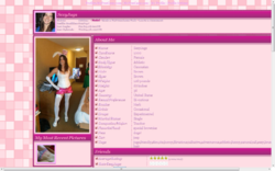
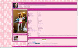
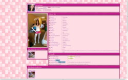
I'm new to the mfc site but someone asked me to do a few things to customize the profile. What do you think for a first timer? http://profiles.myfreecams.com/SexyJugs I usually do web design so this wasn't totally new to me but it was different
rayray said:I'm new to the mfc site but someone asked me to do a few things to customize the profile. What do you think for a first timer? http://profiles.myfreecams.com/SexyJugs I usually do web design so this wasn't totally new to me but it was different
I like it overall, very clean looking. :thumbleft:
As I say many times, IMO a bolder, more contrasted or somewhat larger simple font, other than the default size 8/10, make it much easier to read without having to Ctrl/+++ to make everything larger. That's especially true when the background [pink] and the small font [pink hue with dark outline] are so similar in color. :whistle: model's cute too... :mrgreen:
- Feb 12, 2012
- 6,720
- 27,507
- 161
I like your profile design but the dropshadow on all the text makes it all extremely hard to read. If you want to use your profile to convey any information, you should put it all in high-contrast graphics or remove the dropshadow.rayray said:I'm new to the mfc site but someone asked me to do a few things to customize the profile. What do you think for a first timer? http://profiles.myfreecams.com/SexyJugs I usually do web design so this wasn't totally new to me but it was different
Remember that some people read English as a second language, are dyslexic or are just bad at reading. Having individual letters and words that are hard to visually connect with worsens these problems. In the modern Internet age, many people will look at a page for three seconds and move on if they have to fight with the page to gain the information they want.
rayray said:I'm new to the mfc site but someone asked me to do a few things to customize the profile. What do you think for a first timer? http://profiles.myfreecams.com/SexyJugs I usually do web design so this wasn't totally new to me but it was different
One thing I can not stand is having to scroll side to side on a webpage.
I also do not understand what all this wasted space is on the left and why it keeps getting larger as the screen resolution increases.
The text is unreadable with Google Chrome and invisible with Microsoft Internet Explorer 9.
Attachments
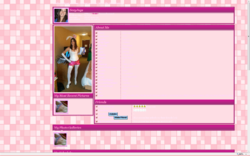
Yes I have to fix the text color and the page position. I'm new to this site so it took me a little getting used to. I did another page I think came out a little better, I photo shopped the girl in the background so it's a little more personal touch. I'm going to totally redo the other page tomorrow.
http://profiles.myfreecams.com/DaisyDolHouse
(FYI I'm not affiliated with these girls at all, just doing these for some freelance work)
http://profiles.myfreecams.com/DaisyDolHouse
(FYI I'm not affiliated with these girls at all, just doing these for some freelance work)
- Status
- Not open for further replies.
Similar threads
- Replies
- 3
- Views
- 403
- Replies
- 19
- Views
- 1K
- Locked
- Replies
- 0
- Views
- 209
- Replies
- 1
- Views
- 160